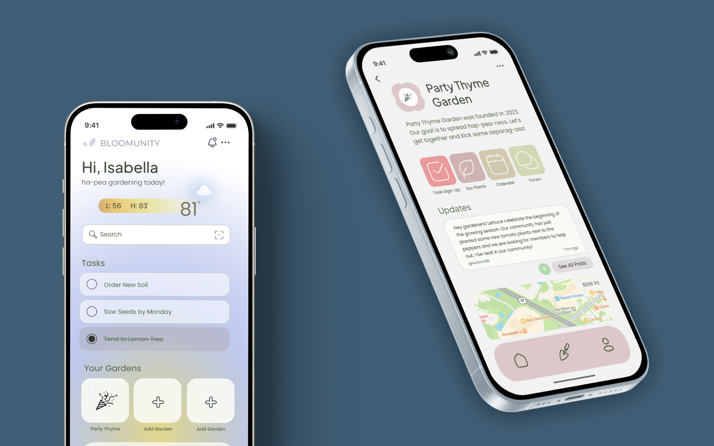
My team researched, designed, and built an interactive prototype to connect, help monitor plants in your community garden, and explore other gardens near you.
During my Interaction Design Course (GD 468), myself and two others were tasked with designing an application for promoting social good. Our GOAL was to create an application that focused on environmental conservation, food accessibility, and waste management.
During the growing season, people who have an interest in gardening and plant care struggle with participating in a fruitful community garden. People often have difficulties with coordinating and maintaining these gardens because of a lack of education, time, and structure.
Because community gardens are not as successful as they could be, community members are pushed to consume more food grown with unnatural chemicals.
Our user research composed of interviewing 9 people and asking them questions to understand their familiarity and interest levels on community gardens, as well as what features they would find to be helpful in a hypothetical application. Once we had completed our interviews, we decided to visually analyze our data and created a flow chart. We wanted to be able to visually group our data based on the similarity of the answers.
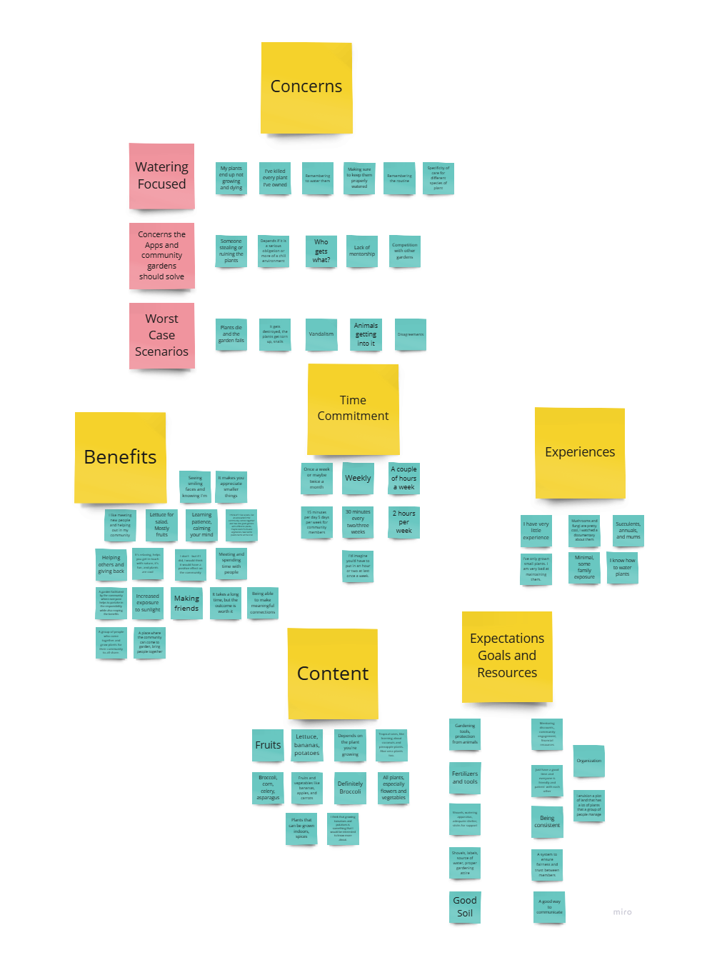
After reviewing our data, we where able to sort our information into 6 categories: Experiences, Content, Time Commitment, Expectations/Goals, Benefits, and Concerns.
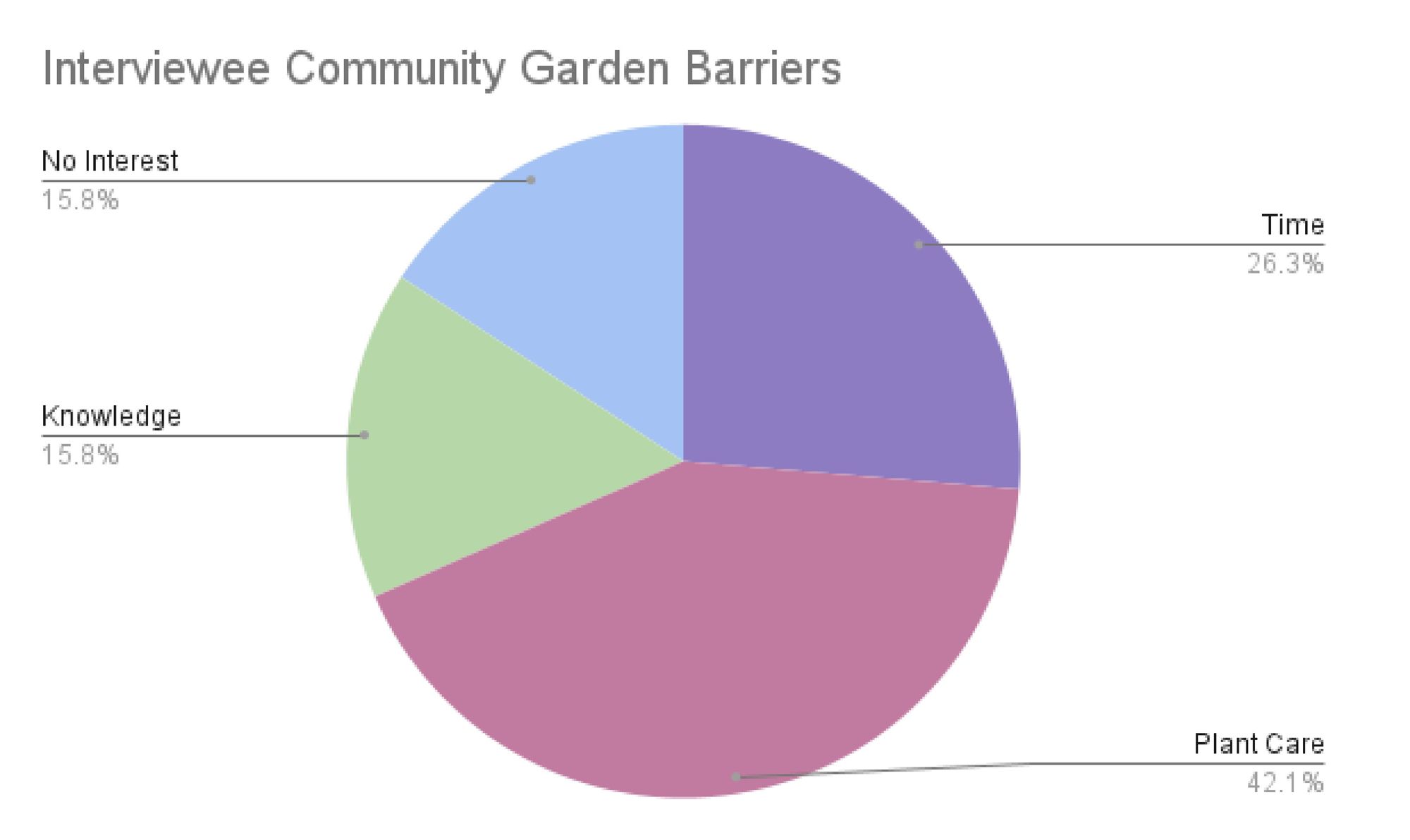
From this information, we wanted to focus on what barriers prevented people from participating in a community garden. From those 6 categories, we picked out the barriers and concerns our interviewees felt about a community garden app. From there, we were able to find that the number 1 barrier was ensuring that the plants received proper care. We wanted to ensure in our final prototype that we accommodated for this barrier. The pie chart pictured shows a distribution of said barriers.
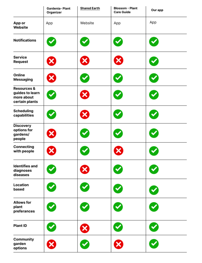
After conducting our preliminary research, we decided to perform a comparative analysis to better understand similar products within the market. We did research and found similar applications to see what features they included and lacked. Our main takeaway from this research was that our app needed to feature online messaging, plant guides, scheduling capabilities, plant identification, and locating community gardens.
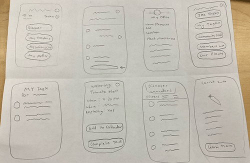
We started the prototyping process by sketching out low-fidelity wireframes. We wanted to get our ideas out on paper and start creating our product. In conjunction with this process, we developed a logical user flow to simulate how someone may use this application.
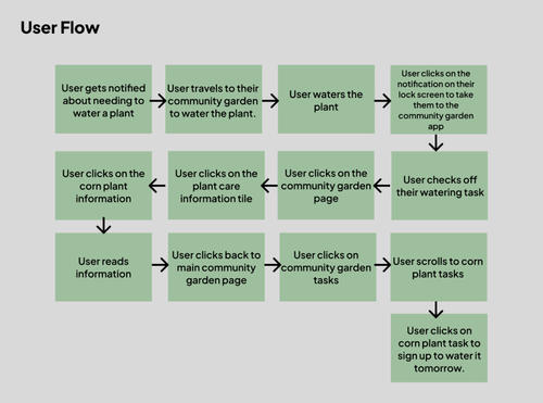
Our user flow was based off a user who would already have an account in Bloomunity. We wanted to highlight the functionality and purpose of the application and have our users interact with the primary features of the application. Specifically, we wanted to highlight the act of caring for a plant, updating its status within the community garden page, and then signing up for a new task.
We then developed more fleshed out wireframes in order to create a digital prototype that we could use for usability testing. These wireframes directly followed our user flow.
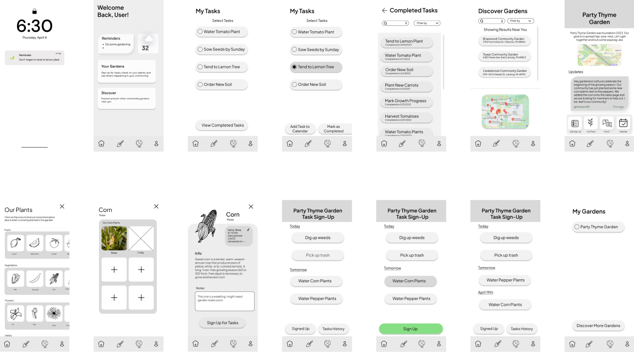
Once we had created our working medium fidelity prototype, we decided to do usability testing before going any further in our design process. We wanted to ensure that we could have a good understanding how our users will interact with our product before moving forward.
We performed 5 different usability tests with three different users.
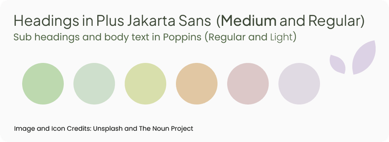
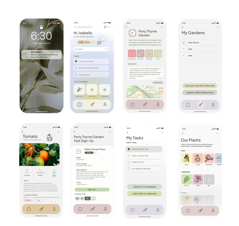
We wanted our design system to ensure our users had an easy to use interface while maintaining a soft and lively tone. In our research, we found many of our interviewees to be intimidated by plant care, so we wanted to be sure our users had a welcoming experience. Below is our style guide and our final design system for our application. A link to an interactive prototype can be accessed by clicking here
There is still a lot of room for development, testing, and research for Bloomunity. This project only scratched the surface of building this application. If we had a larger timeframe we would: